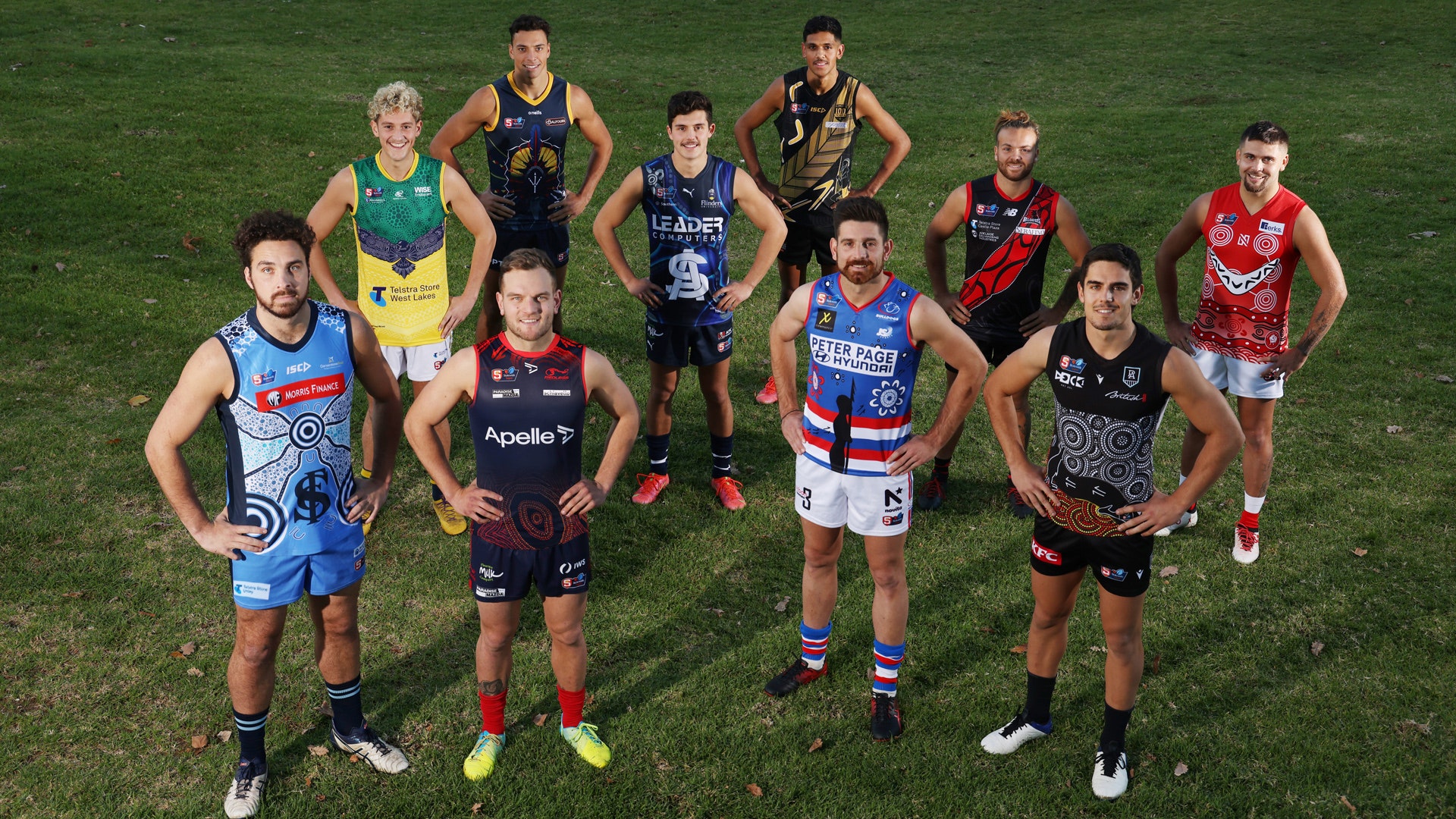
Indigenous Round – every club’s jumper design
As we head into SANFL Statewide Super League Indigenous Round and NAIDOC Week 2021 (July 4-11), here is every club’s stunning jumper design and the unique stories behind them.
Adelaide
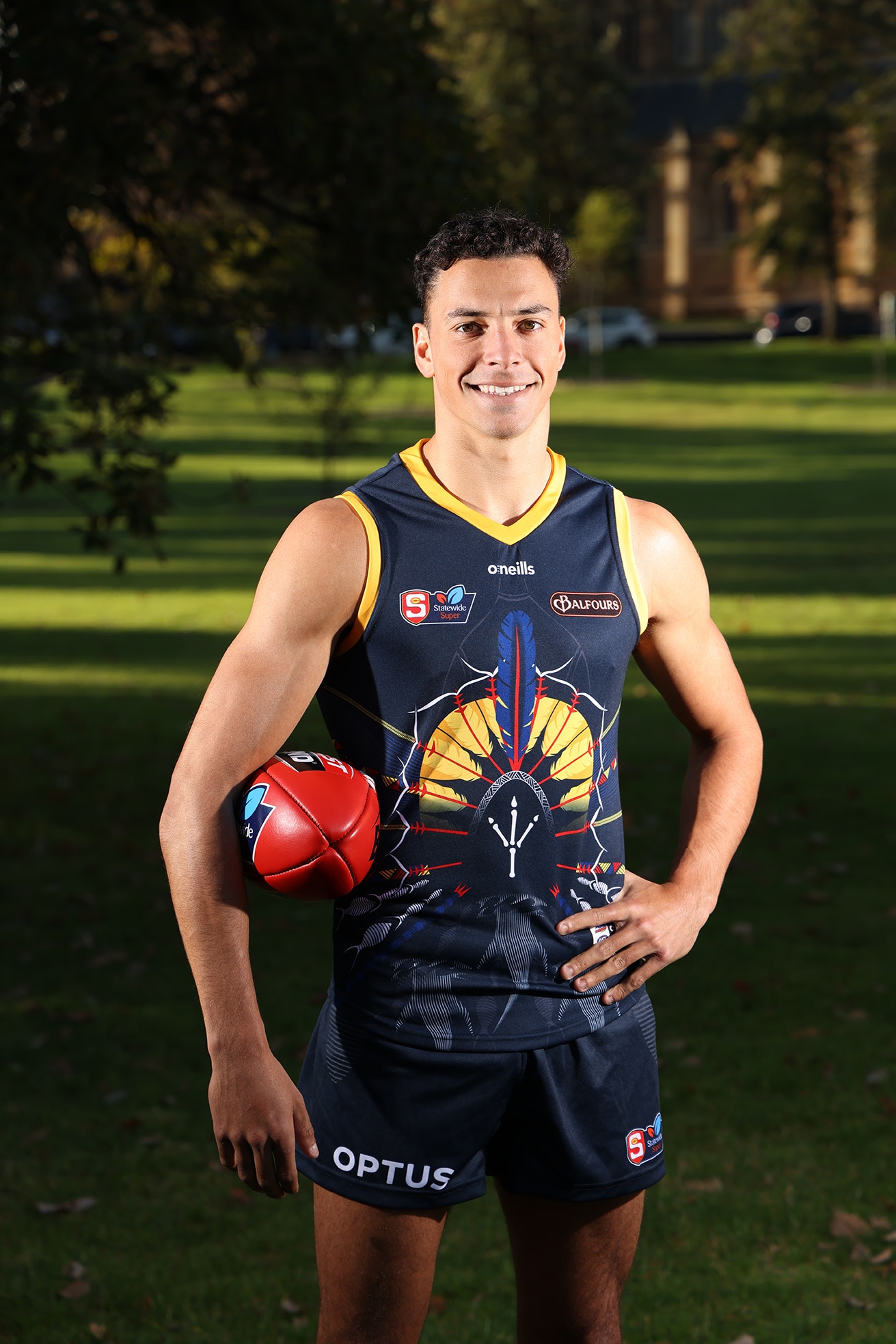
Adelaide’s Ben Davis
Designed by forward Ben Davis, the Adelaide guernsey features a dhoeri, a traditional head dress which is a significant part of Torres Strait Islander culture and represents Davis’ personal story of cultural discovery.
It also includes other Torres Strait Islander elements, including the Hammerhead shark, fish and spears, while the back displays a large turtle, which is the totem for the Torres Strait Island people.
The guernsey honours the country on which Adelaide plays and trains, with a Kaurna shield prominently displayed and connected to the dhoeri.
Adelaide proudly wore its 2021 Indigenous guernsey in Round 9 of the SANFL Statewide Super League against North Adelaide and in the AFL’s Sir Doug Nicholls Round.
Due to a clash with Glenelg’s Indigenous jumper, Adelaide will wear its regular guernsey in Round 13 on Saturday.
Central District
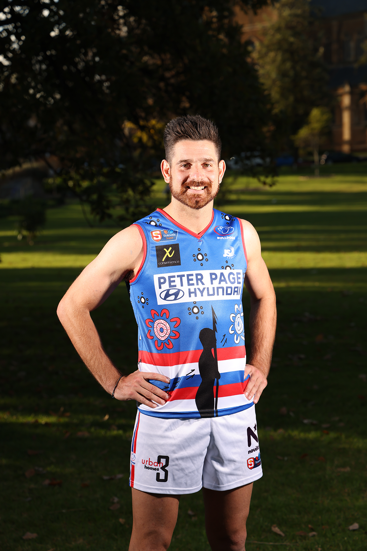
Central District’s Nick Gillard
Designed by Latisha Dodd, Year 12 student at Kaurna Plains School.
“The Land of the Kaurna people”
By Latisha Dodd
On the back of the guernsey I wanted to show the Central Districts players coming together. The circle represents the game as a meeting place and the U shapes are the players.
The kangaroo and bird tracks coming towards the game show how different we all are, with our own strengths.
The blue, red and white dots show the different grounds and country that football games are played on.
On the front of the guernsey, the ‘Blue and White’ meeting places shows the community coming together. The white stars show that we all live under Kaurna skies.
The kangaroo tracks on the front also show strength of the Tarnda the red kangaroo. This also pays respect to “Tarndanyangga” Red Kangaroo Rock, the name for Adelaide and the Kaurna dreaming story behind this.The warrior shows strengths and protection. He reminds us that we are on Kaurna country and shows respect to the Kaurna people.
The warrior is looking out over Kaurna country protecting, protecting animals and people. He never stops standing up for people, country and animals, like Central’s motto, ‘Yield to none’.
Glenelg
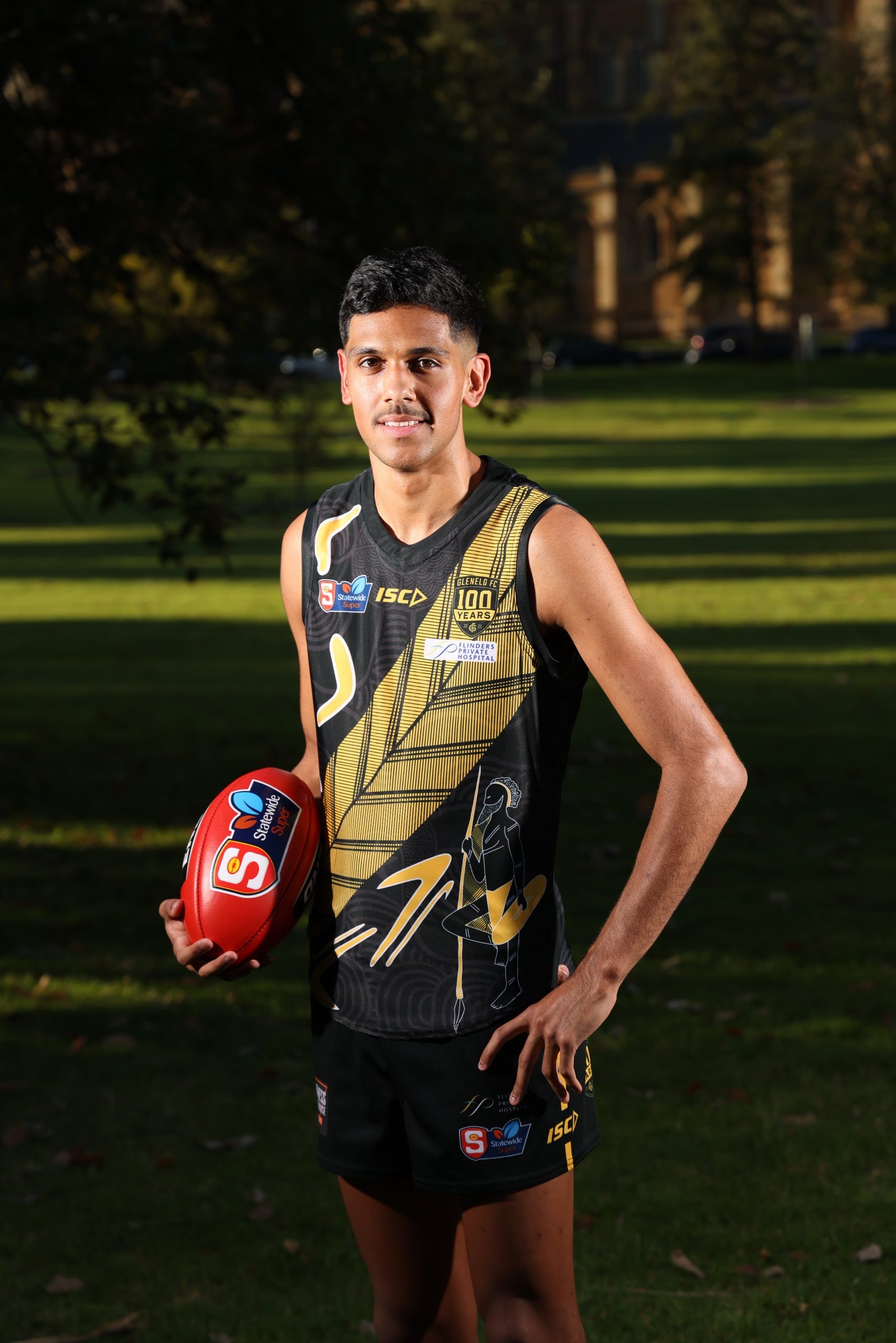
Glenelg’s Nasiah Wanganeen-Milera
Designed by Glenelg senior player Marlon Motlop in conjunction with his cousin, Keelan Fejo.
“Stand Strong”
by Keelan Fejo & Marlon Motlop
The Aboriginal man is holding his spear and shield which represents him standing strong in war/battle – this can reflect how we are when we play the game, for most of us it’s like going to battle.
The cross-hatching (Rarrkbun) represents the direction of strength, power and knowledge when the spear is being thrown.
Boomerangs represent stories/songs – this reflects a connection to footy and how many great stories/songs come out of the game and stay with us forever.
The weapons/tools which represent the effort we give to get to where we are now. The under layer is The Torres Strait Islander head dress, “Dhoeri”, which is a representation of Torres Strait Islander people. The streams in the layer represent the 6 different Indigenous identities at the GFC.
Football is very much like our Aboriginal and Torres Strait Islander culture, when you are apart of a club you are apart of it’s culture, you are committed and the effort you put in will get you to where you want to be – Stand Strong.
North Adelaide
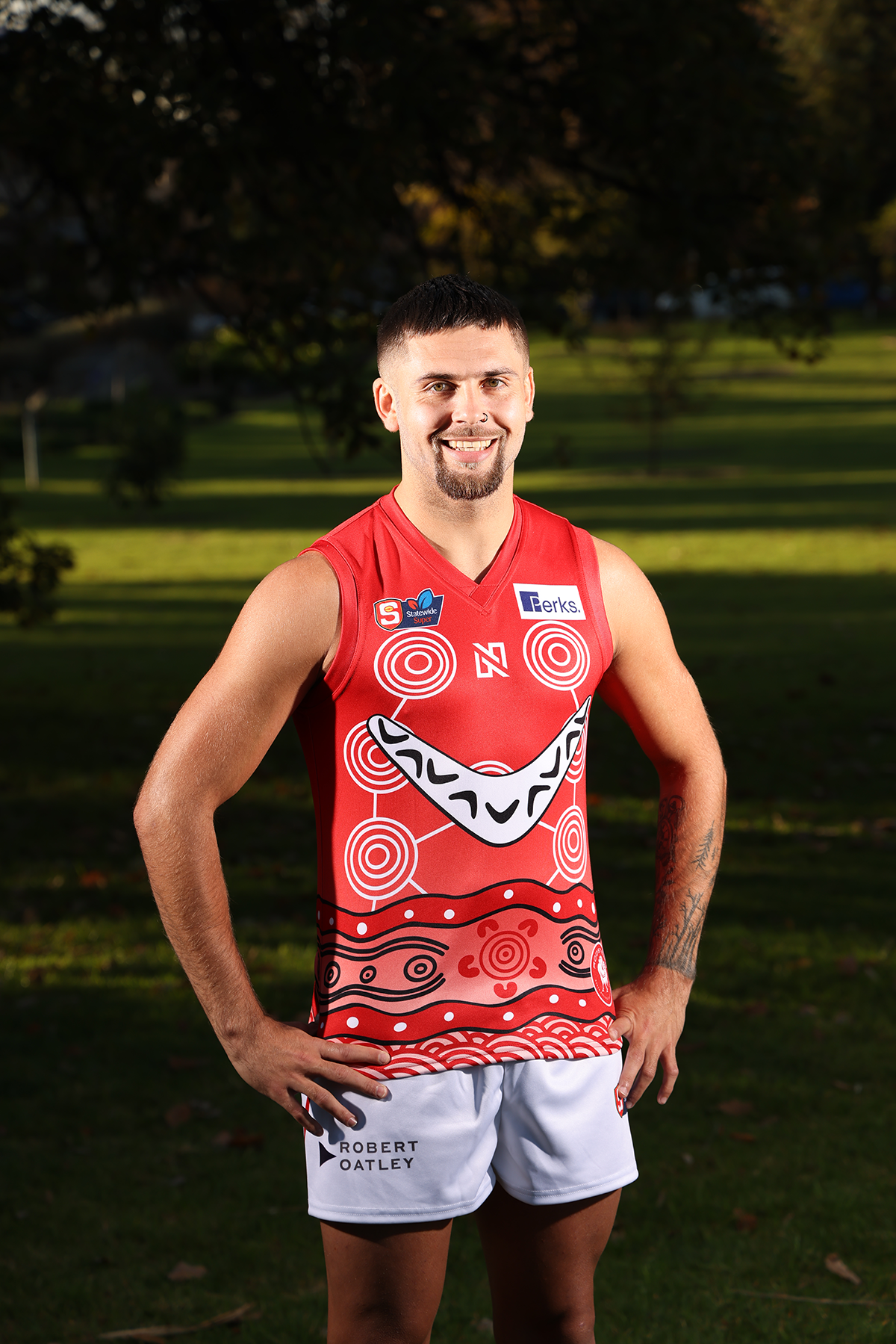
North Adelaide’s Robbie Young
Designed by Blayne O’loughlin and his sister, Karii Doolan-O’loughlin.
By Robbie Young
Repetitive arches at the bottom represent the Lower Southern Arrernte community throughout the Simpson Desert. Wavy lines above and below the middle circle represent the Narungga community throughout the Yorke Peninsula.
The middle circle represents the gathering of the Women’s team, League, Reserves, under 18s and under 16s North Adelaide squads gathering at Prospect Oval.
The V is represented as a boomerang as this tool was only used by the most skilful warriors in hunting, ceremonies and going into battle. This shows that only the most skilful North Adelaide players take to the oval every game day. The smaller boomerangs represent the current nine League and Reserve players.
The larger circles that are connected to each other represent the families and communities that gather around the North Adelaide football community. The names on the back represent the language groups of the League and Reserve players.
Norwood
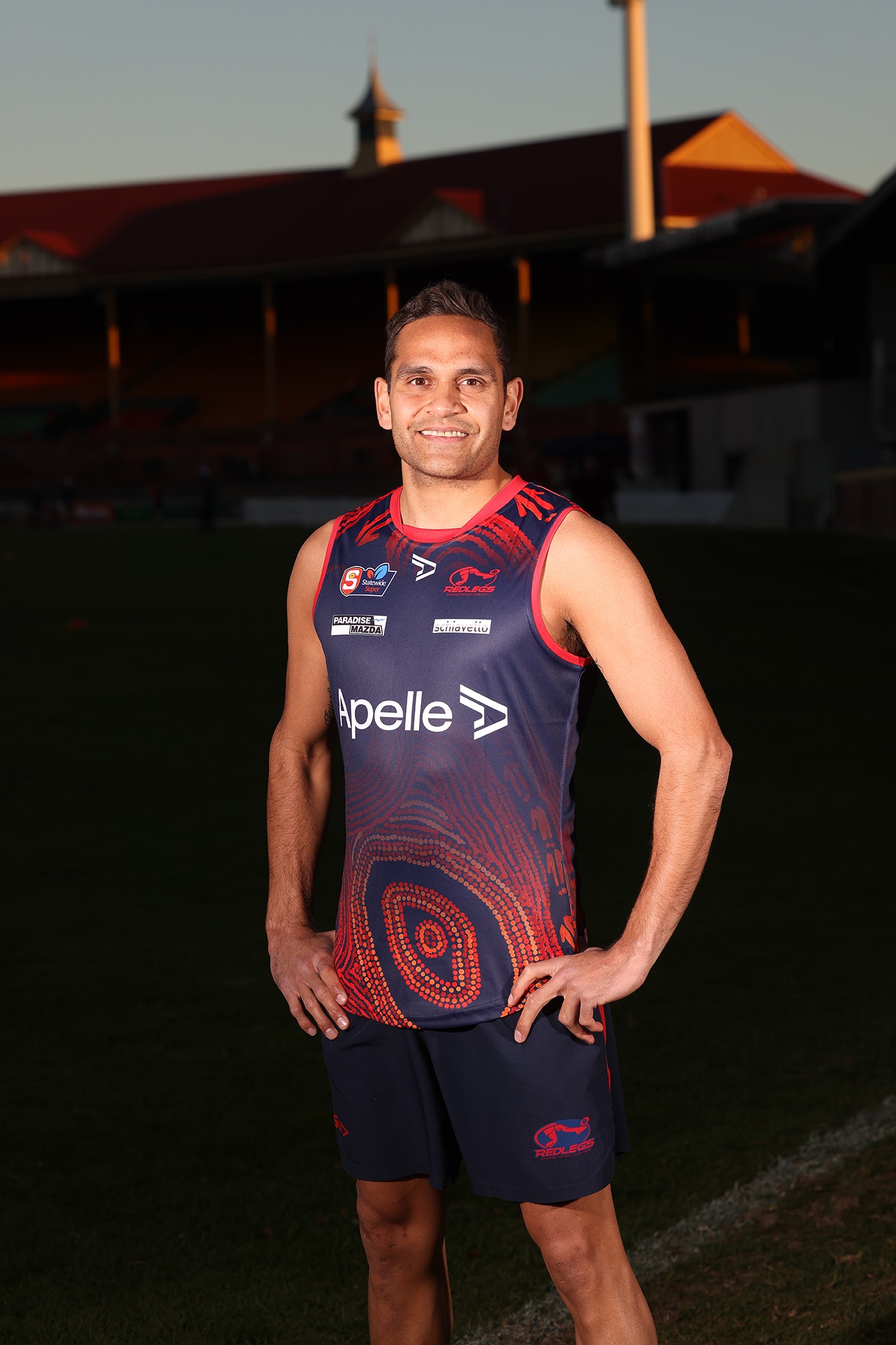
Norwood’s Dom Barry
By Dom Barry (who’s mother, Joanne Ken, is the artist)
Joanne Ken is a Pitjantjatjara-Yankunytjatjara woman born in 1968 near Mimili community and is the daughter of Iwana Ken (dec. 2014) and Fred Tapatapa (dec.1994). Iwana was a Pitjantjatjara woman born in Walytjitjata near the Western Australia, Northern Territory and South Australia tri-state border. Fred was a Yankunytjatjara man whose Country was Mulya Ulpa.
The design is centred around the events that led to Iwana receiving her new Pitjantjatjatjara name, Antjakitja, which she popularly became to be known as throughout her life.
When my nana, Iwana, was around 6 or 7 years old she was swimming in the waterhole near Kanpi with a number of her siblings. One of the older ones Brenton (dec.2018) decided it was time to go back home as it was getting dark, however Iwana wanted one last dip. She got out of the rockhole and started chasing after the siblings by following their footsteps, however still being a young kid she was not experienced at this yet. This resulted in her losing the tracks and so she started yelling out to them however they were too far ahead. She sort of remembers the way back home but was getting scared so she stayed in the one place.
When the siblings returned to the camp, her mum Tjinkuma asked the siblings, “where’s Iwana?” and they just thought she was behind following them. This is when they sent out the search party looking for her, led by a fit young Mr Baker, nguraritja (traditional owner) for Kanpi and others and eventually found her in the early hours of the morning some distance from the rockhole. When they found her she was safe but was scared being alone in the bush. When she returned to main camp, everyone started calling her Antjakitja.
The word Antjaki in Pitjantjatjara means ‘to go on a trip involving camping overnight away from the main camp’. What this design entails is the Kanpi rockhole, Kalaya (emu) ngampu (eggs) for the Kanpi area, and Malu (Kangaroo footprints) for Antjakitja.
Port Adelaide
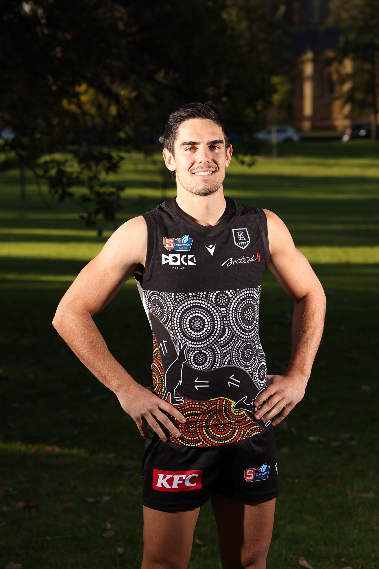
Port Adelaide’s Joel Garner
Port Adelaide Football Club will wear a modified version of its AFL Indigenous round guernsey as part of the SANFL’s 2021 Indigenous Round.
Designed by local artist Elle Campbell, “Kangaroos on the Coast” is based on a painting she created depicting an area of the state’s South East, which is special to her family.
“Mum sent me a video and some photos of some Kangaroos coming out of the scrubland down at the burial ground at Kingston in the South East,” Ms Campbell explained of the inspiration behind her striking design.
“The colours at the bottom represent the burial ground. The brown colours, the yellows colours all represent the sand, the soils, and the trees my family have planted there.
“The red and the black represent my ancestors who are buried there.
“The greens and the blues at the top represent Kingston beach. There’s a lot of seaweed there, hence the greens. The Kangaroos are coming down from the burial ground to have a dip in the water on a warm day, leaving their footprints along their path.”
South Adelaide
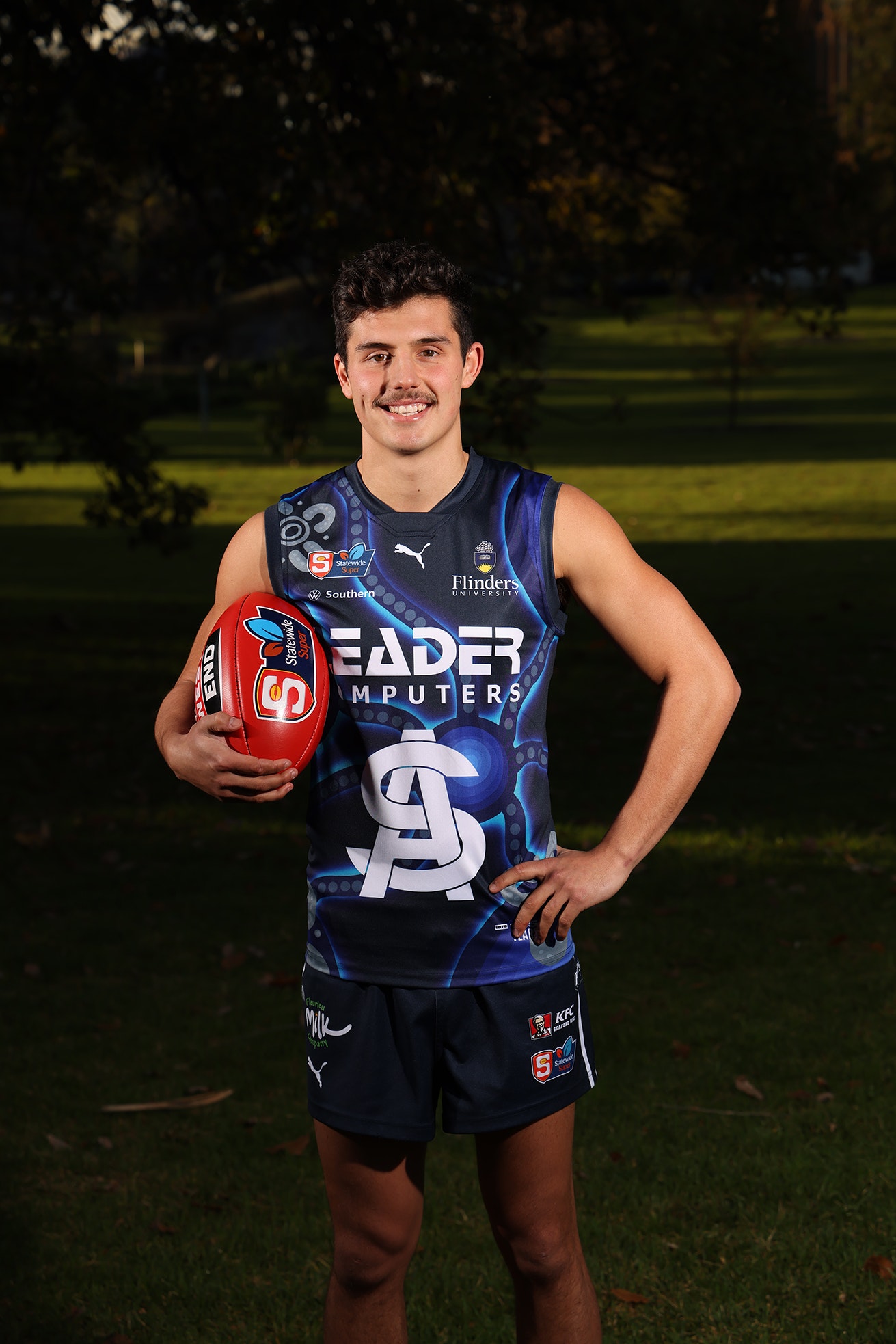
South Adelaide’s Hayden Sampson.
South Adelaide’s Indigenous jumper was designed by Flinders University Student Mya Damon, who is currently studying a Bachelor of Archaeology and has an interest in modern and ancient history as well as visual arts.
As a Barngarla (Whyalla) woman born on Nawu country, Tumby Bay, Mya has a keen interest in archaeology which had begun through her Indigenous and European heritage.
The theme behind the design is connection, specifically the connection between the South Adelaide Football Club and the local southern region.
Mya said that it was great to be able to “include bright colours and symbols to symbolise coming together, community and connection”.
On the front of the guernsey, the design shows meeting places and others coming together as one.
The back of the guernsey symbolises the Panthers’ connection to Port Noarlunga at Flinders University Stadium.
Sturt
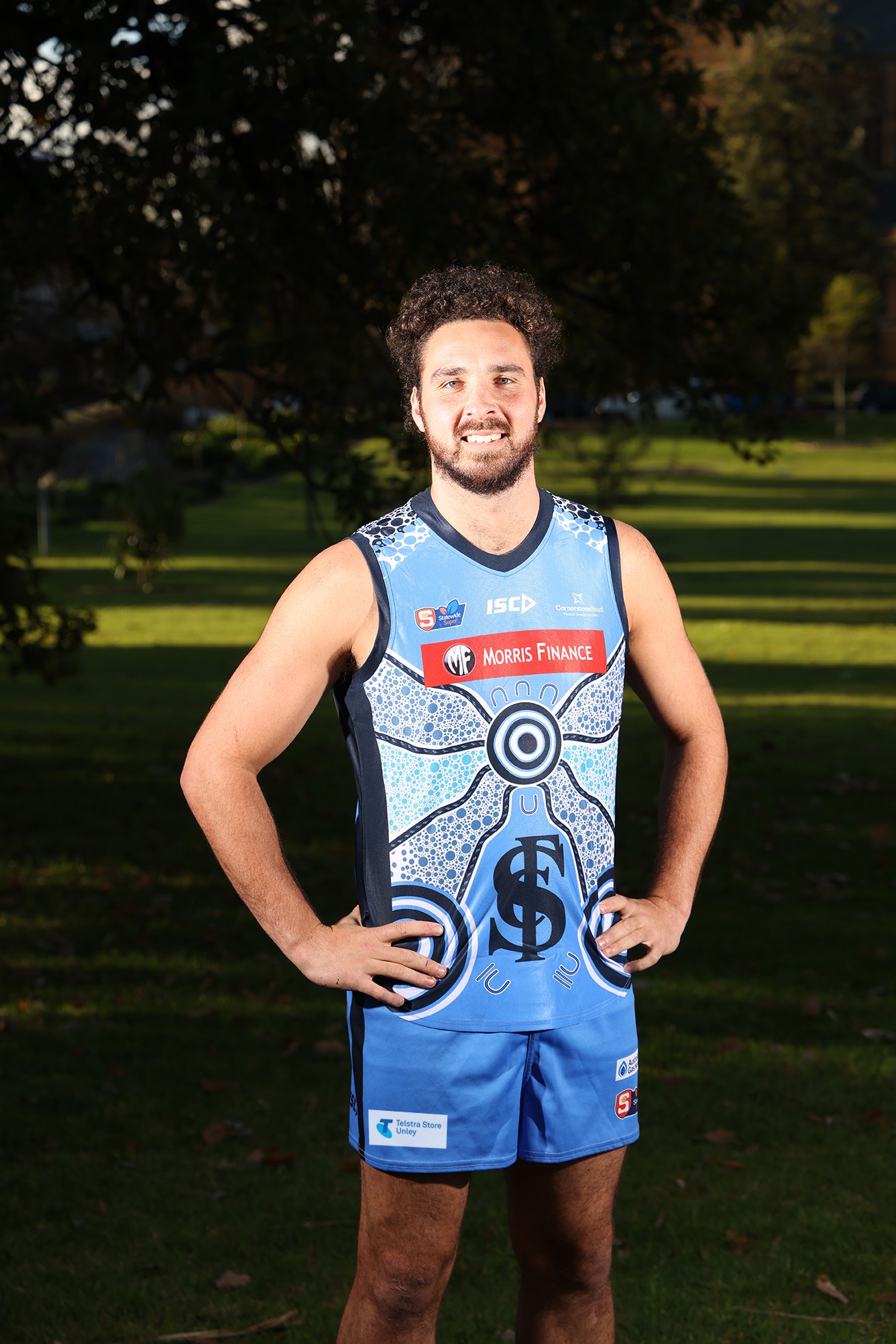
Sturt’s Abe Davis.
Sturt’s Indigenous guernsey design was a collaboration between Jeremy Johncock, a Wirangu and Mirning man and Sturt past player, and Pat Caruso, Eastern Arrarnte graphic artist.
The inspiration for the design is centred around various key elements, including the River Murray, Sturt Football Club community, symbols of male and female and the Kaurna shield.
The flowing River Murray
Artist Pat Caruso explains:
“Jeremy was pretty specific about the water source and the Murray being involved [in the design]. When you look at water, it’s not just one colour tone, it’s impacted by the colours and the environment around it.
“Water and river sources for First Nations people is always a source of food and nourishment and fulfilment for families…so these speak to the information flowing up and down the River Murray and our zone.
“The channels of water come into the heart centre, people travelling towards what we all love. All the dots represent water and because they’re different sizes, they represent all the people in our catchment area and all the fans who come to our games.”
“This element is the committee and staff who represent the team, those who work every day doing the hard yards to make things work.”
The Sturt Community
A focal point of the design, the circle image on the front of the guernsey, is symbolic of the five generations of Sturt Aboriginal and Torres Strait Islander players represented by the five
circles within each other. Paying homage to those who came before us and paved the way so future generations have the privilege of wearing the jumper today.
This concentric circle also represents Unley Oval.
Symbols of male and female
“Jeremy wanted to represent everybody – the symbols of both male and female, for the male and female players and also the fact that it takes many people on the ground to make this Club work,” says Pat Caruso.
The Kaurna shield
Sturt Football Club exists on Kaurna country and it was important to the designers to pay respects to this.
“The Kaurna shield is prominent amongst the people of the Adelaide Plains, where Sturt resides. I thought it was very important to acknowledge that,” Jeremy Johncock explained.
“The Kaurna shield and symbols of male and female sitting either side of it on the back of the guernsey is a symbol of protection, ancestors watching your back, as do your teammates.”
West Adelaide
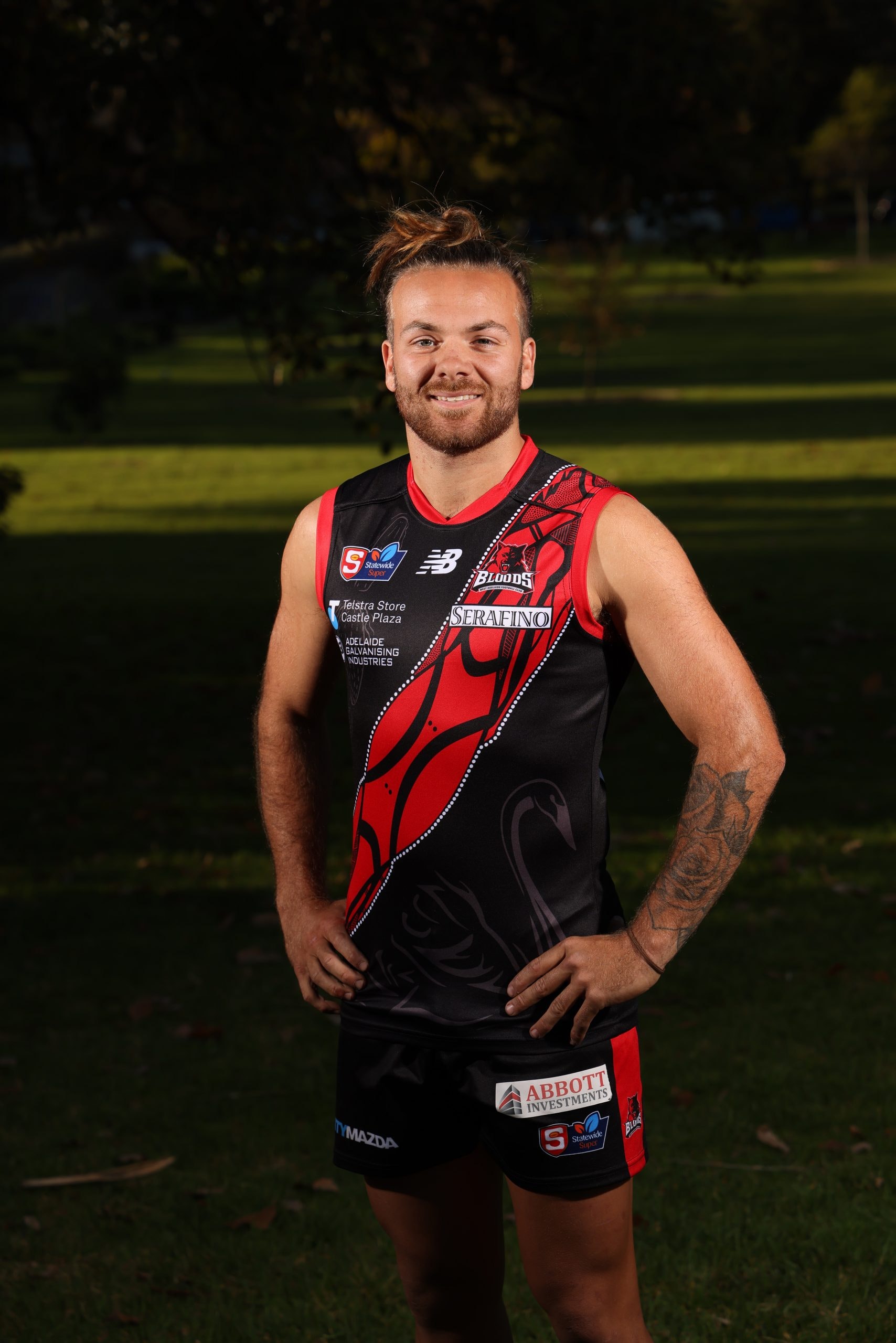
West Adelaide’s Kenny Karpany
Designed by Harley Hall of Aboriginal Art Designs in consultation with West Adelaide senior player Kenny Karpany and Luke Wilson.
By Harley Hall
This design represents “the warrior” with all his hunting weapons and tools ready for combat.
We have the Kaurna shield that represents the traditional people of the Adelaide plains. We have hunting spears, boomerangs, the number 7 hunting boomerang, the spear thrower, clap sticks and fighting clubs. The designs in the background represent circles, weaving and cross hatching. This represents all aboriginal people and clan groups throughout Australia.
We have the players totems on the front being the kungari “the black swan” and the crocodile from the top end of Australia.
On the back we have a community symbol with men and woman sitting around teaching the younger generation. This represents the west adelaide football club as a whole.
The dots represent past indigenous players and there communities and the hands represent myself as the artist and our ancestors and that we are the longest living culture in the world and we have been around for more then 60,000 years plus.
Woodville West Torrens
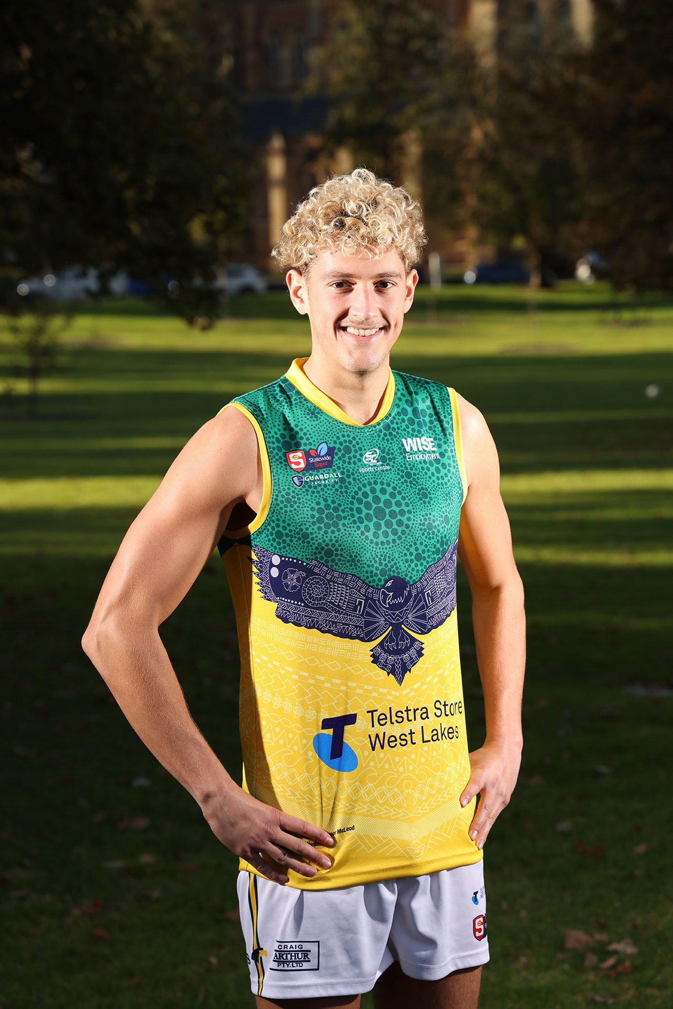
The Eagles’ Connor McLeod
Designed by current WWTFC player Connor McLeod and his dad Andrew, the Eagles’ Indigenous Round jumper was inspired by Connor’s old Eagles training guernsey from the early 2000s, with the intention of composing a piece that reflects the way WWTFC connects to community.
There are many different elements that make up the guernsey, some of those are explained below.
The dots in circle formation at the top of the guernsey in green represent the coming together of people, with the larger circle piece depicting Oval Avenue, a place our players, staff, sponsors and supporters call home.
Included through the design are the totems of our current Indigenous players, with Deakan Jackson and Tyson Stengle’s totem being represented as the Eagle, Mishai Wollogorang has been represented through the Emu feathers on the bottom of the guernsey and Connor and Jase Burgoyne’s totem the Crocodile is embedded as armour a few times within the design to represent protection.
Andrew said:
“The Warrior Head placed at the bottom of the guernsey pays homage to the past of where the Eagles have come from; and hopes to be able to connect past, present and future people to the Club and allow us to honour our past history.
The Eagle represents us, the Woodville West Torrens Eagles, in this pose flying high above in all of its beauty scanning the landscape for prey. Inside the feathers are a representation of the different challenges of the winds we face in the west and how we must adjust and adapt to the changing elements during the footy season. The matting at the top of the Eagle represents coming together, often we would sit on mats made from coconut fibres listening to stories told by our families as a way of staying connected with one another.”
Connor and Andrew have left no stone unturned with their design, incorporating the history of the Eagles with 30 dots across to represent 30 years since the amalgamation. The 4 larger dots within the Eagle represents the success of the Club and our 4 premierships. The chest plate across the Eagle represents a protection element for when our players go into battle; these chest plates are now often worn during ceremonial dance. The drums within the eagle’s tail represent a call to arms for “all of our people, the sounds of our hearts and that adrenaline spike as together we fly”. The spear head through the tail depicts that of a warrior.
Words courtesy of WWTFC.
Related News
-
 First Nations
Strong SANFL connection at 2025 AFL Indigenous All-Stars match
-
 First Nations
SANFL Juniors to celebrate NAIDOC Week with First Nations Round
-
 Checkside Chats
Checkside Chats with Marlon Motlop and Channi Mitchell
-
 First Nations
2024 First Nations Round Guernsey Designs
-
 First Nations
The People’s Champion – Sonny Morey
-
 First Nations
2024 SANFL APY League ready for kickoff
-
 Umpiring
SANFL launches groundbreaking Indigenous Umpiring Program
-
 Community Footy
An ”unreal” experience for SANFL premiership greats


